As someone who has always been captivated by cheetahs, the story of big cats has always been close to my heart. Cheetahs, along with many other big cats in the Felidae family, face increasing threats from the international wildlife trade. This blog post shares the process of creating an infographic that highlights the trade patterns of these magnificent creatures, focusing on data from the Convention on International Trade in Endangered Species of Wild Fauna and Flora (CITES). CITES Appendix I species, which includes many big cats, are at the highest risk of extinction, and international trade is strictly regulated. However, despite these protections, these species are still trafficked for their skins, bones, hunting trophies, and even as live pets.
What inspired me to explore this dataset is my deep connection to cheetahs and the broader struggle to protect endangered species. Through a bubble map, line plot, and bar chart, this infographic seeks to tell the story of how the global exotic animal trade continues to affect these endangered big cats. By visualizing the scale and trends of this trade, I hope to raise awareness about the persistence of this issue and the role of international agreements like CITES in regulating wildlife trade to ensure these incredible creatures have a future in the wild. I have had the incredible opportunity to work with cheetahs in the past, and I want to share my passion for these animals and the importance of protecting them.
Getting up close and personal with Victor the cheetah during my time volunteering at a small zoo in Bonsall, CA in 2020.
About the Data
The data I used is publicly available through the CITES Database, which tracks international trade in wildlife and wildlife products under CITES. CITES collects data from member countries, who are required to report trade transactions involving species listed under the convention. These reports include crucial details such as the type of trade (e.g., imports, exports, re-exports), the species involved, trade quantity, the purpose of the transaction, and the source of the specimens (e.g., wild-caught or captive-bred). This standardized approach allows for monitoring of global wildlife trade and assessing its impact on species conservation.
The dataset I worked with includes key variables such as the year range (from 1975 onwards), the exporter and importer, the source of the species/items (e.g., wild sourced or ranched), the purpose of the transaction (e.g., commercial or scientific), and the trade term (e.g., live individuals, skins, trophies). For my analysis, I focused on the taxon, year, exporter/importer, and trade term, as these provided the most relevant insights into the trade of endangered big cats. Specifically, I used two filtered datasets: exports.csv and exports_imports.csv. Both datasets focus on the trade of Appendix I big cat species from 1975 to the present, with recorded trade terms such as live individuals, skins, bodies, or trophies. The first dataset covers gross exports, while the second combines both exports and imports.
Questions
For this project I am interested in how the international trade of the top threatened and endangered big cats (Felidae family) has evolved over the years. To answer this question I pursued the following three questions:
What are the most commonly traded Appendix I big cats?
How has the international trade of the most common Appendix I cats changed from the establishment of CITES in 1975 until present time?
Who are the top exporting and importing countries of the most commonly traded Appendix I cats?
Creating the Infographic
R Set Up & Data Wrangling
Here I loaded some packages, imported some fonts and icons, and picked some colors for the theme of the infographic:
Code
# ---------------- load libraries --------------------library(tidyverse)library(dplyr)library(here)library(janitor)library(scales)library(networkD3)library(ggplot2)library(patchwork)library(ggtext)library(ARTofR)library(giscoR)library(ggrepel) library(sf)library(png)library(grid)library(showtext)# ---------------- add Color pallette --------------------pal <-c(light_text ="#FFFFF0",bg ="#35431E",map ="#F5F5DC",importer ="#333333",exporter ="#800020")# ---------------- add custom fonts --------------------font_add_google(name ="Montserrat", family ="montserrat")font_add_google(name ="Work Sans", family ="work sans")# ---- use {showtext} to render text for future devices -----showtext::showtext_auto(enable =TRUE) # for importing fonts# ---------------- import GitHub icons --------------------github_icon <-""github_username <-"madicalbert"gh_caption <- glue::glue("<span style='font-family:\"Font Awesome 6 Brands\";'>{github_icon};</span> <span style='color: white'>{github_username}</span>")
Before I can create my infographic I need to wrangle and clean the data so that it can be used for data visualization in my 3 plots:
Code
# ---------------- Data Wrangling --------------------# Two Master Data Frames# Comparative imports / exports datacites <-read.csv(here("posts/2025-03-10-big-cats/data/exports_imports.csv")) %>%clean_names()# Gross exports data gross_exports <-read.csv(here("posts/2025-03-10-big-cats/data/exports.csv")) %>%clean_names()# Clean up gross exports datagross_exports_clean <- gross_exports %>%rename_with(~str_remove(.x, "^x")) %>%pivot_longer(cols =-c("app", "taxon", "term", "unit", "country"),names_to ="year",values_to ="count") %>%mutate(year =as.integer(year),count =case_when( unit %in%c("kg", "m2") ~1,TRUE~as.integer(count)),term =case_when(str_detect(term, "bodies") ~"trophies", #add reoported whole bodies into trophies category for consistency TRUE~ term)) %>%drop_na() %>%filter(app =="I") %>%uncount(count)# Create a df of common names of taxon for easier plotting and readability common_names <-data.frame(taxon =c("Panthera tigris", "Acinonyx jubatus", "Panthera pardus", "Panthera onca"),common_name =c("Tiger", "Cheetah", "Leopard", "Jaguar"))# ---------------- Top Exports Data --------------------# Count occurrences of each taxon and get the top 5top_4 <- gross_exports_clean %>%count(taxon, sort =TRUE) %>%slice_max(n, n =4) top_4 <- top_4 %>%left_join(common_names, by ="taxon")# Make a data frame that is the top 4 speciestop_4_taxa_terms <- gross_exports_clean %>%filter(taxon %in% top_4$taxon) %>%count(taxon, term, sort =TRUE) %>%left_join(common_names, by ="taxon") %>%group_by(common_name) %>%mutate(total_count =sum(n)) %>%ungroup()# --------- Top Exports Across Time Data --------------# Filter for the top 4 species and aggregate by yeargross_exports_agg <- gross_exports_clean %>%filter(taxon %in% top_4$taxon) %>%group_by(year, taxon) %>%summarise(total_count =n(), .groups ='drop') %>%left_join(common_names, by ="taxon") %>%mutate(taxon =fct_reorder(taxon, total_count, .desc =TRUE))# Total counts of the top 4 species by yearcounts_by_year <- gross_exports_agg %>%group_by(year) %>%summarise(total_count =sum(total_count)) # ------------- Exporter/Importer Data -----------------# Create df of exporting and importing countries, quantity, taxon, and term export_country <- cites %>%filter(unit !="kg"& unit !="m2") %>%filter(taxon %in%c("Panthera tigris", "Acinonyx jubatus", "Panthera pardus", "Panthera onca")) %>%select(year, taxon, importer, exporter, importer_reported_quantity, exporter_reported_quantity, term, unit) %>%mutate(total_quantity =pmax(importer_reported_quantity, exporter_reported_quantity, na.rm =TRUE)) %>%select(-importer_reported_quantity, -exporter_reported_quantity)# Create a df of top 10 exporting countries for all species combinedtop_exporters_all <- export_country %>%drop_na() %>%group_by(exporter) %>%summarise(total_quantity =sum(total_quantity)) %>%slice_max(total_quantity, n =10) %>%mutate(exporter =fct_reorder(exporter, total_quantity, .desc =TRUE)) %>%mutate(country = exporter) %>%mutate(type ="Exporter") %>%select(country, total_quantity, type)# Create a df of top 10 importing countries for all species combinedtop_importers_all <- export_country %>%group_by(importer) %>%summarise(total_quantity =sum(total_quantity)) %>%slice_max(total_quantity, n =10) %>%mutate(importer =fct_reorder(importer, total_quantity, .desc =TRUE)) %>%mutate(country = importer) %>%mutate(type ="Importer") %>%select(country, total_quantity, type)# Combine the top 10 exporting and importing countriestop_countries <-rbind(top_importers_all, top_exporters_all)# Get the world polygon for mappingworld <-gisco_get_countries()# Get centroids of countriesworld_centroids <- world %>%st_centroid() %>%# Compute centroidsmutate(lon =st_coordinates(.)[, 1], # Extract lon/latlat =st_coordinates(.)[, 2]) %>%st_drop_geometry() # Convert to a regular dataframeworld_trade <-left_join(world_centroids, top_countries, by =c("FID"="country")) %>%filter(!is.na(total_quantity)) # Remove countries with no data
Bar Chart of Top Exports
The first figure that I want to create it a bar plot that highlights the top 4 most commonly traded threatened and endangered (Appendix I) big cat species. I also want to highlight the term that is being reported (i.e. live animals, hunting trophies, or skins of an animal). This will answer my first question: What are the most commonly traded Appendix I big cats?
Code
#----------------Bar Chart of Top Exports--------------------# Define color palette for trade termsmy_pal <-scale_fill_manual(values =c("live"="#33d2bd", "trophies"="#ff9800","skins"="#E0F4FF"))# Create the bar charttop_cats <- top_4_taxa_terms %>%ggplot(aes(x =fct_reorder(common_name, total_count),y = n, fill =fct_reorder(term, n))) +geom_col() +geom_text(aes(x = common_name, y = total_count, label =ifelse(common_name =="Leopard", "46,285", comma(total_count))),family ="work sans",color ="#FFFFF0",hjust =-0.1,size =4) +coord_flip() +labs(title ="Total exports (from 1975 - 2024) are classified by trade term: <span style='color:#33d2bd;'>**live animals**</span>, <span style='color:#E0F4FF;'>**skins**</span>, or <span style='color:#ff9800;'>**trophies**</span>.",x =NULL,y =NULL,fill =NULL) +theme_minimal() +scale_y_continuous(expand =expansion(mult =c(0, 0.2)), labels = scales::comma) +theme(legend.position ="none",plot.title =element_textbox_simple(size =13,family ="montserrat",color = pal["light_text"],lineheight =1,padding =margin(0, 0, 2, 0)),axis.text =element_text(size =10, family ="work sans",color ="#FFFFF0"),axis.text.x =element_blank(), axis.ticks.x =element_blank(), panel.grid.major.x =element_blank(), panel.grid.minor.x =element_blank(),panel.grid.major.y =element_blank()) + my_pal# Make a barchart with colored background for displaying individuallybarchart_filled <- top_cats +theme(panel.background =element_rect(fill = pal["bg"], color =NA),plot.background =element_rect(fill = pal["bg"], color =NA))barchart_filled
Line Plot of Exports Across Time
My next plot will be a line plot that answers my second question: How has the international trade of the most common Appendix I cats changed from the establishment of CITES in 1975 until present time?
Code
#----------------Line Plot of Exports Across Time--------------------# Define color palette for speciesmy_pal2 <-scale_color_manual(values =c("Cheetah"="#D2B48C", "Jaguar"="#D69A3F", "Leopard"="#FAFAFA","Tiger"="#FF7F32"))# Create the line plot time <-ggplot(gross_exports_agg, aes(x = year, y = total_count, color = common_name)) +geom_line(size =1.2) +geom_vline(xintercept =1975, linetype ="dashed", color ="darkgrey") +annotate(geom ="text",x =1975.5, y =1950, label ="Conference of the Parties (CoP) 1\nlists all 4 big cats under Appendix I,\nimposing the strictest trade limits.",size =3.5, hjust =0, color = pal["light_text"],family ="work sans") +geom_vline(xintercept =1997, linetype ="dashed", color ="darkgrey") +annotate(geom ="text",x =1997.5, y =1950, label ="CoP 10 delists certain\nleopard populations to\nAppendix II.", size =3.5, hjust =0, color = pal["light_text"],family ="work sans") +geom_vline(xintercept =2010, linetype ="dashed", color ="darkgrey") +annotate(geom ="text",x =2010.5, y =1900, label ="CoP 15 establishes the\nResolution and Action Plan\non Big Cats to strengthen\ninternational cooperation.", size =3.5, hjust =0, color = pal["light_text"],family ="work sans") +labs(title ="Total exports of <span style='color:#FAFAFA;'>**leopard**</span>, <span style='color:#FF7F32;'>**tiger**</span>, <span style='color:#D2B48C;'>**cheetah**</span>, and <span style='color:#D69A3F;'>**jaguar**</span>.",x =NULL, y ="Exports",color ="Species", caption ="Visualizations by Madi Calbert | Source: CITES Database") +theme_minimal() +scale_y_continuous(labels = scales::comma) +scale_x_continuous(breaks =seq(1975, 2024, by =5), limits =c(1975, 2023), expand =c(0, 0)) +theme(legend.position ="none", plot.title =element_textbox_simple(size =13,family ="montserrat",color = pal["light_text"],lineheight =1, padding =margin(0, 0, 5, 0)),plot.caption =element_text(size =8, family ="work sans",color = pal["light_text"],face ="italic",margin =margin(t =5)),axis.text =element_text(size =10, family ="work sans",color = pal["light_text"]),axis.title.y =element_text(size =10, family ="work sans",color = pal["light_text"]),panel.grid.major.x =element_blank(), panel.grid.minor.x =element_blank(),panel.grid.major.y =element_blank(), panel.grid.minor.y =element_blank() ) + my_pal2 +theme(panel.background =element_rect(fill = pal["bg"], color =NA),plot.background =element_rect(fill = pal["bg"], color =NA))time
Bubble Map of Exporters/Importers
My final plot will be a bubble map that highlights the top exporting and importing countries and answers my final question: Who are the top exporting and importing countries of the most commonly traded Appendix I cats?
Code
#----------------Bubble Map of Top Exporters/Importers--------------------# Create breaks for the size scalemybreaks <-c(3000, 6000, 10000, 20000)# Plot bubble mapmap <-ggplot() +geom_sf(data = world, fill = pal["map"],color = pal["bg"],size =1) +geom_point(data = world_trade, aes(x = lon, y = lat, size = total_quantity,color = type), alpha =0.7) +scale_size(range =c(1, 13), name ="Trade Quantity", breaks = mybreaks,limits =c(min(world_trade$total_quantity), max(world_trade$total_quantity)),labels =label_comma(),guide ="none") +scale_color_manual(values =c("Importer"= pal["importer"], "Exporter"="#800020"),guide ="none") +labs(title =NULL, color =NULL)+theme_minimal() +coord_sf(xlim =c(-155, 180), ylim =c(-50, 75)) +theme(axis.title =element_blank(), axis.text =element_blank(), axis.ticks =element_blank(),panel.background =element_blank(), panel.grid =element_blank(), panel.border =element_blank())# Add background for displaying individuallymap_filled <- map +theme(panel.background =element_rect(fill = pal["bg"], color =NA),plot.background =element_rect(fill = pal["bg"], color =NA))map_filled
Text Annotation
Here I create my title, subtitle, and legend for the infographic:
Code
#----------------Title, Subtitle, and Legend--------------------# title plottitle_plot <-ggplot() +annotate("text", x =0.8, y =1, label ="Trafficked & Traded: The Fate of the World's Big Cats",family ="montserrat", size =8, color ="#FFFFF0", fontface ="bold") +theme_void() # subtitle plotsubtitle_plot <-ggplot() +annotate("text", x =0.8, y =1, label ="Exploring the Global Market Threatening These Iconic Predators Using the CITES Database",family ="work sans", size =6, color ="#FFFFF0") +theme_void() # adding map legend back in legend <-readPNG(here("posts/2025-03-10-big-cats/images/legend.png"))legend <-ggplot() +annotation_custom(rasterGrob(legend), xmin =-Inf, xmax =Inf, ymin =-Inf, ymax =Inf) +theme_void()
Base Infographic
Now to create a base template in ggplot2 that will serve as the foundation of my infographic. First, I create an empty ggplot() object and set the color background here and adjust the margins:
Code
#----------------Base Infographic--------------------# Base template ggplot for infographic g_base <-ggplot() +theme_void() +theme(plot.background =element_rect(fill = pal["bg"], color = pal["bg"]),plot.margin =margin(b =0, t =0, r =0, l =0) )
Creative Elements
Next, I add creative elements to the base template. I will be adding images of big cats (leopard, cheetah, tiger) and the CITES logo using the package png. These creative elements will be used to enhance the visual appeal of the infographic:
Lastly, I am using the patchwork package to add layers of inset elements/plots using inset_element so that my figures and creative elements are nicely stacked.
We are then left with the final result:
Code
#----------------Stitching Together--------------------final_fig <- g_base +# plotsinset_element(map,left =0, bottom =0.47, right =1, top =0.9) +inset_element(top_cats,left =0, bottom =0.01,right =0.39, top =0.47) +inset_element(time,left =0.38,bottom =0,right =0.99,top =0.47) +#legendinset_element(legend,left =0.16,bottom =0.48,right =0.26,top =0.78) +#creative elementsinset_element(leopard_gg,left =-0.15, bottom =0.4, right =0.35, top =1) +inset_element(cheetah_gg,left =0.86,bottom =0.55,right =0.97,top =0.85) +inset_element(tiger_gg,left =0.18,bottom =-0.5,right =0.39,top =0.7) +inset_element(cites_gg,left =0.87, bottom =0.9, right =1, top =0.99) +# title & subtitle inset_element(title_plot,left =0, bottom =0.94, right =1, top =1) +inset_element(subtitle_plot,left =0, bottom =0.91, right =1, top =0.94) final_fig
Graphic form: I used a bubble map, line plot, and bar chart to visualize the data. The bubble map shows the top exporting and importing countries and adds a spatial element to the visualization. I really wanted to include data on both importing and exporting countries to show where these animals are coming from and where they are going. I also choose a line plot that illustrates the change in exports over time, I felt that this was the best way to showcase the temporal element of my data. And lastly, I went with a stacked bar chart to highlight the most commonly traded big cats and really show the large discrepency between trade quantity in leopards compared to the other big cats.
Text: I used a mix of titles, captions, and annotations to provide context and guide the viewer through the data. The titles and subtitles help set the stage for the infographic, while the annotations on the line plot highlight key events in the history of CITES and big cat trade. I also used axis labels and text to provide additional information and context for the visualizations.
Themes: I choose a forest green background color to represent to the rainforest habitats that most of these big cats thrive in. I included three images of my focal species to add a visual element to the infographic and to highlight the charismatic nature of these animals and draw the audience in.
Colors: In addition to my forest green background, I used a lighter off-white color for the text to make it stand out against the background. I used a dark red color for the exporting countries and a black color for the importing countries on the bubble map to represent the danger that these big cats are in due to the trade. I used a light blue color for the skins trade, a teal color for the live animal trade, and an orange color for the trophies trade in the bar chart to differentiate between the different trade terms. These colors also match my image of the leopard that I include on the infographic. For the bar chart, I used a light grey color for the leopard, a dark grey color for the tiger, a light brown color for the cheetah, and a dark brown color for the jaguar in the line plot to differentiate between the different species.
Typography: I used two different fonts for the text in the infographic. I used the “Montserrat” font for the titles and captions to give them a bold and modern look. I used the “Work Sans” font for the axis labels and annotations to provide a clean and readable style. I also used a larger font size for the titles and a smaller font size for the labels to create a visual hierarchy and guide the viewer through the infographic.
General design: The general design here was to start with the map at the top to orientate the reader to where in the world are we focusing on. The images of the top 3 cats and the title also help to orientate the reader about the topic. Then I included the bar chart to show the top 4 species and their trade terms. I then included the line plot to show the change in exports over time. I used a clean and minimal design to avoid information overload and to make the data and visualizations the focal point of the infographic. I also used a consistent color scheme and font style throughout the infographic to create a cohesive and visually appealing design.
Data Contextualization: I included annotations on the line plot to provide context for key events in the history of CITES and big cat trade. This helps the viewer understand the significance of these events and how they have impacted the trade of big cats over time. I also included a legend on the map to explain the color coding for exporting and importing countries. This helps the viewer interpret the data and understand the spatial distribution of big cat trade. My bar plot and line plot also have titles to explain what is being visualized.
Centering Primary Message: The primary message of this infographic is to raise awareness about the international trade of big cats and the threats they face due to this trade. By visualizing the scale and patterns of big cat trade, the goal is to highlight the importance of conservation efforts and international agreements like CITES in protecting these iconic species. The images of the big cats and the CITES logo help to reinforce this message and draw attention to the urgency of addressing the illegal wildlife trade.
Accessibility: I utilize alt text in my figures to make them more accessible to those who may be visually impaired. I also use a colorblind-friendly palette in my visualizations to ensure that the data is clear and easy to interpret for all viewers. I also use a high contrast color scheme to make the text and visualizations stand out against the background and improve readability.
Diversity Equity and Inclusion (DEI): Although my infographic is somewhat lacking a DEI focus, I did try to consider the communities and places represented in my data by highlighting the top exporting and importing countries of big cats. Notably, the leading exporters are in Southern Africa, while the top importers are Western countries such as the U.S., Canada, and various European nations. Additionally, I framed my questions and findings in a way that underscores the importance of protecting these iconic species and the necessity of international cooperation to address the threats they face.
Works Cited
CITES Secretariat and UNEP-WCMC (2022). A guide to using the CITES Trade Database. Version 9. Geneva, Switzerland, and Cambridge, UK.
Citation
BibTeX citation:
@online{calbert2025,
author = {Calbert, Madison},
title = {Trafficked \& {Traded:} {The} {Fate} of the {World’s} {Big}
{Cats}},
date = {2025-07-13},
url = {https://madicalbert.github.io/posts/2025-03-10-big-cats/},
langid = {en}
}
---title: "Trafficked & Traded: The Fate of the World's Big Cats"description: "Creating an infographic to explore the global markets threatening these iconic predators."author: - name: Madison Calbert url: https://madicalbert.github.io/ affiliation: EDS 240 Data Visualization Course - Master of Environmental Science & Management Program @ The Bren School (UCSB) affiliation-url: https://bren.ucsb.edu/masters-programs/master-environmental-science-and-management date: last-modifiedcategories: [Data Science]citation: url: https://madicalbert.github.io/posts/2025-03-10-big-cats/ image: preview-image.pngexecute: eval: true echo: true warning: false message: falseformat: html: toc: true code-fold: true code-tools: true embed-resources: trueeditor: visual---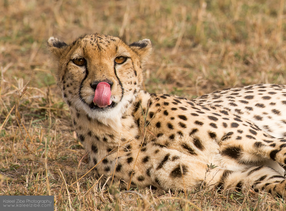{fig-align="left" width="889"}## IntroductionAs someone who has always been captivated by cheetahs, the story of big cats has always been close to my heart. Cheetahs, along with many other big cats in the *Felidae* family, face increasing threats from the international wildlife trade. This blog post shares the process of creating an infographic that highlights the trade patterns of these magnificent creatures, focusing on data from the [Convention on International Trade in Endangered Species of Wild Fauna and Flora (CITES)](https://cites.org/eng). CITES Appendix I species, which includes many big cats, are at the highest risk of extinction, and international trade is strictly regulated. However, despite these protections, these species are still trafficked for their skins, bones, hunting trophies, and even as live pets.What inspired me to explore this dataset is my deep connection to cheetahs and the broader struggle to protect endangered species. Through a bubble map, line plot, and bar chart, this infographic seeks to tell the story of how the global exotic animal trade continues to affect these endangered big cats. By visualizing the scale and trends of this trade, I hope to raise awareness about the persistence of this issue and the role of international agreements like CITES in regulating wildlife trade to ensure these incredible creatures have a future in the wild. I have had the incredible opportunity to work with cheetahs in the past, and I want to share my passion for these animals and the importance of protecting them.<p align="center"><img src="images/cheetah_madi.jpeg" alt="Getting up close and personal with Victor the cheetah"/> <br> <em>Getting up close and personal with Victor the cheetah during <br> my time volunteering at a small zoo in Bonsall, CA in 2020.</em></p>## About the DataThe data I used is publicly available through the [CITES Database](https://trade.cites.org/), which tracks international trade in wildlife and wildlife products under CITES. CITES collects data from member countries, who are required to report trade transactions involving species listed under the convention. These reports include crucial details such as the type of trade (e.g., imports, exports, re-exports), the species involved, trade quantity, the purpose of the transaction, and the source of the specimens (e.g., wild-caught or captive-bred). This standardized approach allows for monitoring of global wildlife trade and assessing its impact on species conservation.The dataset I worked with includes key variables such as the year range (from 1975 onwards), the exporter and importer, the source of the species/items (e.g., wild sourced or ranched), the purpose of the transaction (e.g., commercial or scientific), and the trade term (e.g., live individuals, skins, trophies). For my analysis, I focused on the taxon, year, exporter/importer, and trade term, as these provided the most relevant insights into the trade of endangered big cats. Specifically, I used two filtered datasets: `exports.csv` and `exports_imports.csv`. Both datasets focus on the trade of Appendix I big cat species from 1975 to the present, with recorded trade terms such as live individuals, skins, bodies, or trophies. The first dataset covers gross exports, while the second combines both exports and imports.## QuestionsFor this project I am interested in how the international trade of the top threatened and endangered big cats (*Felidae* family) has evolved over the years. To answer this question I pursued the following three questions:1. What are the most commonly traded Appendix I big cats?2. How has the international trade of the most common Appendix I cats changed from the establishment of CITES in 1975 until present time?3. Who are the top exporting and importing countries of the most commonly traded Appendix I cats?## Creating the Infographic### R Set Up & Data WranglingHere I loaded some packages, imported some fonts and icons, and picked some colors for the theme of the infographic:```{r}#| eval: true#| echo: true#| warning: false#| message: false# ---------------- load libraries --------------------library(tidyverse)library(dplyr)library(here)library(janitor)library(scales)library(networkD3)library(ggplot2)library(patchwork)library(ggtext)library(ARTofR)library(giscoR)library(ggrepel) library(sf)library(png)library(grid)library(showtext)# ---------------- add Color pallette --------------------pal <-c(light_text ="#FFFFF0",bg ="#35431E",map ="#F5F5DC",importer ="#333333",exporter ="#800020")# ---------------- add custom fonts --------------------font_add_google(name ="Montserrat", family ="montserrat")font_add_google(name ="Work Sans", family ="work sans")# ---- use {showtext} to render text for future devices -----showtext::showtext_auto(enable =TRUE) # for importing fonts# ---------------- import GitHub icons --------------------github_icon <-""github_username <-"madicalbert"gh_caption <- glue::glue("<span style='font-family:\"Font Awesome 6 Brands\";'>{github_icon};</span> <span style='color: white'>{github_username}</span>")```Before I can create my infographic I need to wrangle and clean the data so that it can be used for data visualization in my 3 plots:```{r}# ---------------- Data Wrangling --------------------# Two Master Data Frames# Comparative imports / exports datacites <-read.csv(here("posts/2025-03-10-big-cats/data/exports_imports.csv")) %>%clean_names()# Gross exports data gross_exports <-read.csv(here("posts/2025-03-10-big-cats/data/exports.csv")) %>%clean_names()# Clean up gross exports datagross_exports_clean <- gross_exports %>%rename_with(~str_remove(.x, "^x")) %>%pivot_longer(cols =-c("app", "taxon", "term", "unit", "country"),names_to ="year",values_to ="count") %>%mutate(year =as.integer(year),count =case_when( unit %in%c("kg", "m2") ~1,TRUE~as.integer(count)),term =case_when(str_detect(term, "bodies") ~"trophies", #add reoported whole bodies into trophies category for consistency TRUE~ term)) %>%drop_na() %>%filter(app =="I") %>%uncount(count)# Create a df of common names of taxon for easier plotting and readability common_names <-data.frame(taxon =c("Panthera tigris", "Acinonyx jubatus", "Panthera pardus", "Panthera onca"),common_name =c("Tiger", "Cheetah", "Leopard", "Jaguar"))# ---------------- Top Exports Data --------------------# Count occurrences of each taxon and get the top 5top_4 <- gross_exports_clean %>%count(taxon, sort =TRUE) %>%slice_max(n, n =4) top_4 <- top_4 %>%left_join(common_names, by ="taxon")# Make a data frame that is the top 4 speciestop_4_taxa_terms <- gross_exports_clean %>%filter(taxon %in% top_4$taxon) %>%count(taxon, term, sort =TRUE) %>%left_join(common_names, by ="taxon") %>%group_by(common_name) %>%mutate(total_count =sum(n)) %>%ungroup()# --------- Top Exports Across Time Data --------------# Filter for the top 4 species and aggregate by yeargross_exports_agg <- gross_exports_clean %>%filter(taxon %in% top_4$taxon) %>%group_by(year, taxon) %>%summarise(total_count =n(), .groups ='drop') %>%left_join(common_names, by ="taxon") %>%mutate(taxon =fct_reorder(taxon, total_count, .desc =TRUE))# Total counts of the top 4 species by yearcounts_by_year <- gross_exports_agg %>%group_by(year) %>%summarise(total_count =sum(total_count)) # ------------- Exporter/Importer Data -----------------# Create df of exporting and importing countries, quantity, taxon, and term export_country <- cites %>%filter(unit !="kg"& unit !="m2") %>%filter(taxon %in%c("Panthera tigris", "Acinonyx jubatus", "Panthera pardus", "Panthera onca")) %>%select(year, taxon, importer, exporter, importer_reported_quantity, exporter_reported_quantity, term, unit) %>%mutate(total_quantity =pmax(importer_reported_quantity, exporter_reported_quantity, na.rm =TRUE)) %>%select(-importer_reported_quantity, -exporter_reported_quantity)# Create a df of top 10 exporting countries for all species combinedtop_exporters_all <- export_country %>%drop_na() %>%group_by(exporter) %>%summarise(total_quantity =sum(total_quantity)) %>%slice_max(total_quantity, n =10) %>%mutate(exporter =fct_reorder(exporter, total_quantity, .desc =TRUE)) %>%mutate(country = exporter) %>%mutate(type ="Exporter") %>%select(country, total_quantity, type)# Create a df of top 10 importing countries for all species combinedtop_importers_all <- export_country %>%group_by(importer) %>%summarise(total_quantity =sum(total_quantity)) %>%slice_max(total_quantity, n =10) %>%mutate(importer =fct_reorder(importer, total_quantity, .desc =TRUE)) %>%mutate(country = importer) %>%mutate(type ="Importer") %>%select(country, total_quantity, type)# Combine the top 10 exporting and importing countriestop_countries <-rbind(top_importers_all, top_exporters_all)# Get the world polygon for mappingworld <-gisco_get_countries()# Get centroids of countriesworld_centroids <- world %>%st_centroid() %>%# Compute centroidsmutate(lon =st_coordinates(.)[, 1], # Extract lon/latlat =st_coordinates(.)[, 2]) %>%st_drop_geometry() # Convert to a regular dataframeworld_trade <-left_join(world_centroids, top_countries, by =c("FID"="country")) %>%filter(!is.na(total_quantity)) # Remove countries with no data```### Bar Chart of Top ExportsThe first figure that I want to create it a bar plot that highlights the top 4 most commonly traded threatened and endangered (Appendix I) big cat species. I also want to highlight the term that is being reported (i.e. live animals, hunting trophies, or skins of an animal). This will answer my first question: **What are the most commonly traded Appendix I big cats?**```{r}#| eval: true#| echo: true#| warning: false#| message: false#----------------Bar Chart of Top Exports--------------------# Define color palette for trade termsmy_pal <-scale_fill_manual(values =c("live"="#33d2bd", "trophies"="#ff9800","skins"="#E0F4FF"))# Create the bar charttop_cats <- top_4_taxa_terms %>%ggplot(aes(x =fct_reorder(common_name, total_count),y = n, fill =fct_reorder(term, n))) +geom_col() +geom_text(aes(x = common_name, y = total_count, label =ifelse(common_name =="Leopard", "46,285", comma(total_count))),family ="work sans",color ="#FFFFF0",hjust =-0.1,size =4) +coord_flip() +labs(title ="Total exports (from 1975 - 2024) are classified by trade term: <span style='color:#33d2bd;'>**live animals**</span>, <span style='color:#E0F4FF;'>**skins**</span>, or <span style='color:#ff9800;'>**trophies**</span>.",x =NULL,y =NULL,fill =NULL) +theme_minimal() +scale_y_continuous(expand =expansion(mult =c(0, 0.2)), labels = scales::comma) +theme(legend.position ="none",plot.title =element_textbox_simple(size =13,family ="montserrat",color = pal["light_text"],lineheight =1,padding =margin(0, 0, 2, 0)),axis.text =element_text(size =10, family ="work sans",color ="#FFFFF0"),axis.text.x =element_blank(), axis.ticks.x =element_blank(), panel.grid.major.x =element_blank(), panel.grid.minor.x =element_blank(),panel.grid.major.y =element_blank()) + my_pal# Make a barchart with colored background for displaying individuallybarchart_filled <- top_cats +theme(panel.background =element_rect(fill = pal["bg"], color =NA),plot.background =element_rect(fill = pal["bg"], color =NA))barchart_filled```### Line Plot of Exports Across TimeMy next plot will be a line plot that answers my second question: **How has the international trade of the most common Appendix I cats changed from the establishment of CITES in 1975 until present time?**```{r}#| eval: true#| echo: true#| warning: false#| message: false#----------------Line Plot of Exports Across Time--------------------# Define color palette for speciesmy_pal2 <-scale_color_manual(values =c("Cheetah"="#D2B48C", "Jaguar"="#D69A3F", "Leopard"="#FAFAFA","Tiger"="#FF7F32"))# Create the line plot time <-ggplot(gross_exports_agg, aes(x = year, y = total_count, color = common_name)) +geom_line(size =1.2) +geom_vline(xintercept =1975, linetype ="dashed", color ="darkgrey") +annotate(geom ="text",x =1975.5, y =1950, label ="Conference of the Parties (CoP) 1\nlists all 4 big cats under Appendix I,\nimposing the strictest trade limits.",size =3.5, hjust =0, color = pal["light_text"],family ="work sans") +geom_vline(xintercept =1997, linetype ="dashed", color ="darkgrey") +annotate(geom ="text",x =1997.5, y =1950, label ="CoP 10 delists certain\nleopard populations to\nAppendix II.", size =3.5, hjust =0, color = pal["light_text"],family ="work sans") +geom_vline(xintercept =2010, linetype ="dashed", color ="darkgrey") +annotate(geom ="text",x =2010.5, y =1900, label ="CoP 15 establishes the\nResolution and Action Plan\non Big Cats to strengthen\ninternational cooperation.", size =3.5, hjust =0, color = pal["light_text"],family ="work sans") +labs(title ="Total exports of <span style='color:#FAFAFA;'>**leopard**</span>, <span style='color:#FF7F32;'>**tiger**</span>, <span style='color:#D2B48C;'>**cheetah**</span>, and <span style='color:#D69A3F;'>**jaguar**</span>.",x =NULL, y ="Exports",color ="Species", caption ="Visualizations by Madi Calbert | Source: CITES Database") +theme_minimal() +scale_y_continuous(labels = scales::comma) +scale_x_continuous(breaks =seq(1975, 2024, by =5), limits =c(1975, 2023), expand =c(0, 0)) +theme(legend.position ="none", plot.title =element_textbox_simple(size =13,family ="montserrat",color = pal["light_text"],lineheight =1, padding =margin(0, 0, 5, 0)),plot.caption =element_text(size =8, family ="work sans",color = pal["light_text"],face ="italic",margin =margin(t =5)),axis.text =element_text(size =10, family ="work sans",color = pal["light_text"]),axis.title.y =element_text(size =10, family ="work sans",color = pal["light_text"]),panel.grid.major.x =element_blank(), panel.grid.minor.x =element_blank(),panel.grid.major.y =element_blank(), panel.grid.minor.y =element_blank() ) + my_pal2 +theme(panel.background =element_rect(fill = pal["bg"], color =NA),plot.background =element_rect(fill = pal["bg"], color =NA))time```### Bubble Map of Exporters/ImportersMy final plot will be a bubble map that highlights the top exporting and importing countries and answers my final question: **Who are the top exporting and importing countries of the most commonly traded Appendix I cats?**```{r}#| eval: true#| echo: true#| warning: false#| message: false#----------------Bubble Map of Top Exporters/Importers--------------------# Create breaks for the size scalemybreaks <-c(3000, 6000, 10000, 20000)# Plot bubble mapmap <-ggplot() +geom_sf(data = world, fill = pal["map"],color = pal["bg"],size =1) +geom_point(data = world_trade, aes(x = lon, y = lat, size = total_quantity,color = type), alpha =0.7) +scale_size(range =c(1, 13), name ="Trade Quantity", breaks = mybreaks,limits =c(min(world_trade$total_quantity), max(world_trade$total_quantity)),labels =label_comma(),guide ="none") +scale_color_manual(values =c("Importer"= pal["importer"], "Exporter"="#800020"),guide ="none") +labs(title =NULL, color =NULL)+theme_minimal() +coord_sf(xlim =c(-155, 180), ylim =c(-50, 75)) +theme(axis.title =element_blank(), axis.text =element_blank(), axis.ticks =element_blank(),panel.background =element_blank(), panel.grid =element_blank(), panel.border =element_blank())# Add background for displaying individuallymap_filled <- map +theme(panel.background =element_rect(fill = pal["bg"], color =NA),plot.background =element_rect(fill = pal["bg"], color =NA))map_filled```### Text AnnotationHere I create my title, subtitle, and legend for the infographic:```{r}#| eval: true#| echo: true#| warning: false#| message: false#----------------Title, Subtitle, and Legend--------------------# title plottitle_plot <-ggplot() +annotate("text", x =0.8, y =1, label ="Trafficked & Traded: The Fate of the World's Big Cats",family ="montserrat", size =8, color ="#FFFFF0", fontface ="bold") +theme_void() # subtitle plotsubtitle_plot <-ggplot() +annotate("text", x =0.8, y =1, label ="Exploring the Global Market Threatening These Iconic Predators Using the CITES Database",family ="work sans", size =6, color ="#FFFFF0") +theme_void() # adding map legend back in legend <-readPNG(here("posts/2025-03-10-big-cats/images/legend.png"))legend <-ggplot() +annotation_custom(rasterGrob(legend), xmin =-Inf, xmax =Inf, ymin =-Inf, ymax =Inf) +theme_void()```### Base InfographicNow to create a base template in `ggplot2` that will serve as the foundation of my infographic. First, I create an empty `ggplot()` object and set the color background here and adjust the margins:```{r}#| eval: true#| echo: true#| warning: false#| message: false#----------------Base Infographic--------------------# Base template ggplot for infographic g_base <-ggplot() +theme_void() +theme(plot.background =element_rect(fill = pal["bg"], color = pal["bg"]),plot.margin =margin(b =0, t =0, r =0, l =0) )```### Creative ElementsNext, I add creative elements to the base template. I will be adding images of big cats (leopard, cheetah, tiger) and the CITES logo using the package `png`. These creative elements will be used to enhance the visual appeal of the infographic:```{r}#| eval: true#| echo: true#| warning: false#| message: false#----------------Creative Elements--------------------#leopard imageleopard <- png::readPNG(here("posts/2025-03-10-big-cats/images/leopard.png"))leopard_gg <-ggplot() +annotation_custom(rasterGrob(leopard), xmin =-Inf, xmax =Inf, ymin =-Inf, ymax =Inf) +theme_void()#cheetah imagecheetah <-readPNG(here("posts/2025-03-10-big-cats/images/cheetah2.png"))cheetah_gg <-ggplot() +annotation_custom(rasterGrob(cheetah), xmin =-Inf, xmax =Inf, ymin =-Inf, ymax =Inf) +theme_void()# tiger imagetiger <-readPNG(here("posts/2025-03-10-big-cats/images/tiger.png"))tiger_gg <-ggplot() +annotation_custom(rasterGrob(tiger), xmin =-Inf, xmax =Inf, ymin =-Inf, ymax =Inf) +theme_void()# CITES logo cites <-readPNG(here("posts/2025-03-10-big-cats/images/cites_logo.png"))cites_gg <-ggplot() +annotation_custom(rasterGrob(cites), xmin =-Inf, xmax =Inf, ymin =-Inf, ymax =Inf) +theme_void()```## Final InfographicLastly, I am using the `patchwork` package to add layers of inset elements/plots using `inset_element` so that my figures and creative elements are nicely stacked.We are then left with the final result:```{r}#| eval: true#| echo: true#| warning: false#| message: false#| fig-width: 14#| fig-height: 8.5#----------------Stitching Together--------------------final_fig <- g_base +# plotsinset_element(map,left =0, bottom =0.47, right =1, top =0.9) +inset_element(top_cats,left =0, bottom =0.01,right =0.39, top =0.47) +inset_element(time,left =0.38,bottom =0,right =0.99,top =0.47) +#legendinset_element(legend,left =0.16,bottom =0.48,right =0.26,top =0.78) +#creative elementsinset_element(leopard_gg,left =-0.15, bottom =0.4, right =0.35, top =1) +inset_element(cheetah_gg,left =0.86,bottom =0.55,right =0.97,top =0.85) +inset_element(tiger_gg,left =0.18,bottom =-0.5,right =0.39,top =0.7) +inset_element(cites_gg,left =0.87, bottom =0.9, right =1, top =0.99) +# title & subtitle inset_element(title_plot,left =0, bottom =0.94, right =1, top =1) +inset_element(subtitle_plot,left =0, bottom =0.91, right =1, top =0.94) final_fig```## Design Elements::: panel-tabset#### Graphic form**Graphic form:** I used a bubble map, line plot, and bar chart to visualize the data. The bubble map shows the top exporting and importing countries and adds a spatial element to the visualization. I really wanted to include data on both importing and exporting countries to show where these animals are coming from and where they are going. I also choose a line plot that illustrates the change in exports over time, I felt that this was the best way to showcase the temporal element of my data. And lastly, I went with a stacked bar chart to highlight the most commonly traded big cats and really show the large discrepency between trade quantity in leopards compared to the other big cats.#### Text**Text:** I used a mix of titles, captions, and annotations to provide context and guide the viewer through the data. The titles and subtitles help set the stage for the infographic, while the annotations on the line plot highlight key events in the history of CITES and big cat trade. I also used axis labels and text to provide additional information and context for the visualizations.#### Themes**Themes:** I choose a forest green background color to represent to the rainforest habitats that most of these big cats thrive in. I included three images of my focal species to add a visual element to the infographic and to highlight the charismatic nature of these animals and draw the audience in.#### Colors**Colors:** In addition to my forest green background, I used a lighter off-white color for the text to make it stand out against the background. I used a dark red color for the exporting countries and a black color for the importing countries on the bubble map to represent the danger that these big cats are in due to the trade. I used a light blue color for the skins trade, a teal color for the live animal trade, and an orange color for the trophies trade in the bar chart to differentiate between the different trade terms. These colors also match my image of the leopard that I include on the infographic. For the bar chart, I used a light grey color for the leopard, a dark grey color for the tiger, a light brown color for the cheetah, and a dark brown color for the jaguar in the line plot to differentiate between the different species.#### Typography**Typography:** I used two different fonts for the text in the infographic. I used the "Montserrat" font for the titles and captions to give them a bold and modern look. I used the "Work Sans" font for the axis labels and annotations to provide a clean and readable style. I also used a larger font size for the titles and a smaller font size for the labels to create a visual hierarchy and guide the viewer through the infographic.#### General Design**General design:** The general design here was to start with the map at the top to orientate the reader to where in the world are we focusing on. The images of the top 3 cats and the title also help to orientate the reader about the topic. Then I included the bar chart to show the top 4 species and their trade terms. I then included the line plot to show the change in exports over time. I used a clean and minimal design to avoid information overload and to make the data and visualizations the focal point of the infographic. I also used a consistent color scheme and font style throughout the infographic to create a cohesive and visually appealing design.#### Data Contextualization**Data Contextualization:** I included annotations on the line plot to provide context for key events in the history of CITES and big cat trade. This helps the viewer understand the significance of these events and how they have impacted the trade of big cats over time. I also included a legend on the map to explain the color coding for exporting and importing countries. This helps the viewer interpret the data and understand the spatial distribution of big cat trade. My bar plot and line plot also have titles to explain what is being visualized.#### Centering Primary Message**Centering Primary Message:** The primary message of this infographic is to raise awareness about the international trade of big cats and the threats they face due to this trade. By visualizing the scale and patterns of big cat trade, the goal is to highlight the importance of conservation efforts and international agreements like CITES in protecting these iconic species. The images of the big cats and the CITES logo help to reinforce this message and draw attention to the urgency of addressing the illegal wildlife trade.#### Accessibility**Accessibility:** I utilize alt text in my figures to make them more accessible to those who may be visually impaired. I also use a colorblind-friendly palette in my visualizations to ensure that the data is clear and easy to interpret for all viewers. I also use a high contrast color scheme to make the text and visualizations stand out against the background and improve readability.#### Diversity Equity and Inclusion (DEI)**Diversity Equity and Inclusion (DEI):** Although my infographic is somewhat lacking a DEI focus, I did try to consider the communities and places represented in my data by highlighting the top exporting and importing countries of big cats. Notably, the leading exporters are in Southern Africa, while the top importers are Western countries such as the U.S., Canada, and various European nations. Additionally, I framed my questions and findings in a way that underscores the importance of protecting these iconic species and the necessity of international cooperation to address the threats they face.:::## Works CitedCITES Secretariat and UNEP-WCMC (2022). A guide to using the CITES Trade Database. Version 9. Geneva, Switzerland, and Cambridge, UK.


